Need Help With Your Business Plan?
Answer tailored questions and get a detailed business plan in minutes.
Bar Chart: Definition & In-Depth Explanation
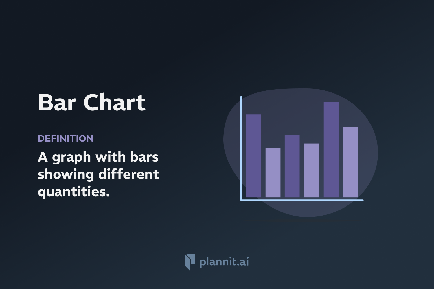
A bar chart is a graphical display of data using bars of different heights or lengths. It is a versatile chart that can be used to represent data related to counts, percentages, values, and other quantitative measures across different categories. Bar charts are commonly used in finance, marketing, statistics, business analysis, and many other fields to provide a visual comparison of data.
Purpose:
The purpose of a bar chart is to make comparisons among various groups more evident and to help visualize trends or patterns in the data. By using bars to show quantities, these charts allow readers to quickly assess relative sizes and changes over time, making complex data more accessible and understandable.
Example:
In a business scenario, a bar chart might be used to compare the sales performance of different products over a certain period. Each bar represents a product, and the height or length of the bar corresponds to the sales volume of that product. By viewing the chart, stakeholders can easily compare which products are performing better and assess market trends.
Related Terms:
Histogram: A type of bar chart that represents the distribution of numerical data by showing the frequency of data points within certain range of values (bins).
Stacked Bar Chart: A variant of the bar chart where each bar is divided into sub-bars stacked on top of each other, representing multiple variables or categories together.
Clustered Bar Chart: This type of bar chart displays two or more data series in clustered horizontal or vertical bars, which helps compare multiple variables.
Axis Labels: Text labels that describe the type of data represented on the axes of a chart, crucial for interpreting the data correctly.
FAQs:
What is the difference between a bar chart and a column chart?
Bar charts display data horizontally, while column charts display data vertically. The choice between them often depends on the specific layout or emphasis desired in presenting the data.
When should you use a bar chart?
Bar charts are best used when you want to compare quantities across different categories, especially when the category names are long or there are more than a few categories.
Can bar charts be used for time series data?
While bar charts can be used for time series data, line charts are generally more effective for showing trends over time due to their continuous nature.
How can you make a bar chart more informative?
Adding value labels, using consistent colors, keeping the design simple, and properly labeling axes are key steps to making a bar chart more informative and easier to understand.
Are there limitations to using bar charts?
Bar charts may not be suitable for large datasets with many categories or for displaying relationships between two continuous variables. They are also less effective in showing correlations or how variables affect each other.
Get funding with a business plan that will impress investors.
Starting a New Business?

Recommended
Bar Chart

Customer Acquisition Cost (CAC)